Metro Mobile Case Study
Figma | Independent Case Study | Fall 2020 | UI Design, UX Research, Prototyping
OVERVIEW
After residing in the Tri-State area for twenty years, I have come across several inconveniences with the New York subway system.“Metro Mobile” is an application that replaces and redesigns the standard New York City Metropolitan Transportation Authority (MTA) system. It enables users to easily purchase, refill, and scan Metro card tickets through a digital platform. Moreover, the app allows users to keep a record of their previous transactions while traveling through New York City.
The Problem
The current physical Metrocard system raises a plethora of problems. The tangible state of this card already makes it one step closer to being lost or stolen. Alongside this, the process to buy a card can be extremely time-consuming and frustrating especially since the machines may often be outdated causing them to function poorly. While these are all recurring qualms of the current NYC MTA system, the recent pandemic also raises the question of hygiene. When purchasing a Metrocard, you must be in physical contact with a purchasing machine that has already been touched by many other hands. The standard MTA system not only makes it frustrating to purchase a card but it may raise potential health concerns.
The Current Solution
Transfer the system into a digital space. New York is already making riding the subway into a personal space with the recent installation of OMNY pay On-the-Go credit card systems and it’s important to extend this system beyond the current credit card purchase and have a digital Metrocard become a viable option to ride the subway.
RESEARCH
To bring my application to life, I conducted some preliminary research to further understand the main concerns of the current Metrocard system. I surveyed individuals who lived in New York, lived within the range of the New York metropolitan area, and those who are not from the area and visit New York on rare occasions.
I decided to ask general questions about their primary purpose for visiting New York and their usual form of transportation.
Along with general questions about their trip, I wanted to know what their feelings were towards the current MTA standard. I allowed them to comment “N/A” if they did not have anything they wanted to say about the current system.
Likes:
“Quick way to pay for public transport”
“It’s easy to understand”
“It’s convenient.”
Dislikes:
“Machines suck and are dirty”
“I can never swipe it properly and the line gets held up behind me.”
“How easy it is to misplace the card”
“I wish that you could upload a $___ amount onto the card, instead of the given options that they provide for you.”
“I often forget to refill my card or get a new card when my card expires and the process to refill/get a new one takes forever and I might miss my train.”

IDEATION
After conducting user research, I was able to have a greater understanding of what people liked about the New York MTA system and what they did not like about it. Thus, I was able to clearly define some of the goals I have to combat some user problems while designing this application.
Keep it simple and accessible
Make it hygienic
Give the user more freedom
After outlining my goals, I decided to implement these features in my application.
Possible features:
Simple UI
Mobile payment and digital wallet — Similar to Apple Pay
Custom payment amount feature for the card.
Notification messages for low balance/ close expiration date

Wireframing
Next, I planned to execute my written goals of this application through rough iterations of my planned screens.

When constructing my wireframes, my main goals in mind were simplicity and accessibility. A common like amongst my survey participants was the convenient, easy-to-use interface of the current MTA system. Since this is a likable aspect I wanted to keep my iterations just as simple. I tried to reduce any unnecessary wording from my features and limited the card purchasing process to only two to three buttons per screen so that the user can easily navigate through their choices. With this in mind, I wanted to create my layouts to be using an ample amount of white space.
Styling

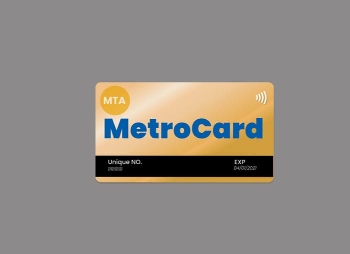
Along with completely redesigning the MTA system, I decided to redesign the Metrocard itself. Like the original, physical Metrocard, I decided to keep the same color scheme — with a gradient consisting of yellow hues. Alongside this, I’ve kept the same hue of blue for the large eye-catching Metrocard logo in the center. As for my own changes, I implemented a contactless payment symbol on the top right corner to indicate that this card can be used as a form of e-payment. I’ve also incorporated a “UNIQUE NO.” tag which assigns every digital Metrocard its own numerical value to distinguish it from other metro cards. Lastly, I’ve added the expiration date label onto the front side of the card to keep users aware of when their card will be expiring.
FINAL DESIGN
After creating my low fidelity wireframes, I finally took the final step and began creating high fidelity mockup screens for the application. As mentioned, I decided to keep the overall color scheme of the application similar to the original branding of the Metrocard. Moreover, along with the branding of this application, I created my designs with features to respond to some of the user’s current problems with the MTA card system.

While I was designing the screens for purchasing a new Metrocard, I wanted to keep my UI similar to the current UI of the MTA machines. By keeping the compositions rather similar, users who have already been familiar with the current MTA standard can easily navigate through the steps to purchase their Metrocard. I had also included a progress bar underneath the buttons so users would be aware of how far they have come in purchasing their e-card.

Custom Amount
A common wish from current MTA subway users was the ability to add a custom value/time amount for their card. I decided to implement the “Custom Amount” feature to the “Amount” screen so users have the flexibility to input their own desired amount onto the digital card.

Scan and Pay
The digital e-payment feature was to combat a multitude of problems. For one, with this feature, users can now easily pay for rides using the current OMNY digital mobile payment system. Similar to other mobile payment applications, the user would need to verify their identity with Face-ID or Fingerprint verification to make any ride purchases. This two-step verification was implemented to prevent the chances of fraudulent activity. Moreover, this digital payment feature makes can be efficient as users would no longer need to physically swipe their cards to get through the gate. This will cause entrance traffic to subway platforms to lessen.

My Wallet
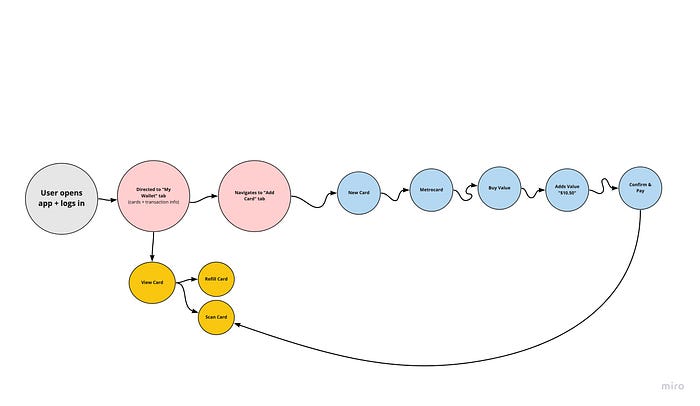
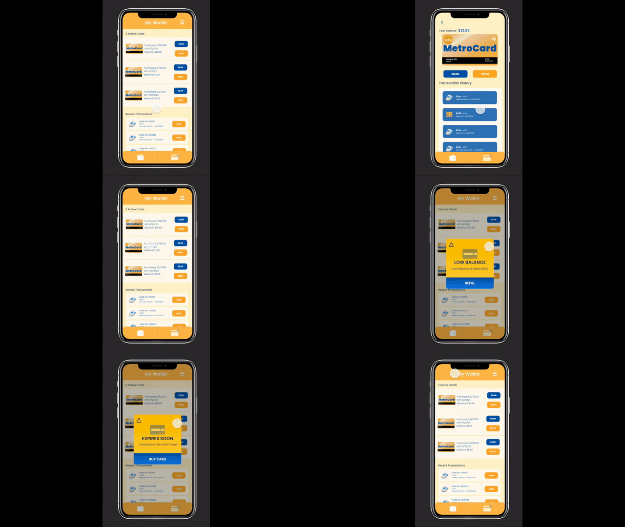
The application also has a “My Wallet” tab for users This feature is currently located on the left-hand side of the navigation bar. On this tab, users can view the current cards they have in their wallet. They may also select an individual card and view the card’s current balance, expiration date, transaction history, and access to the “Scan” and “Refill buttons. If a user selects a card that has a low balance ( <$5.00) they will receive a pop-up message indicating that their card balance is low and prompting them to refill their card. Likewise, this pop-up message will also appear if a user selects a card with a closing expiration date — this pop-up will prompt the user to buy a new card.
Conclusion
After concluding my first formal case study, I most definitely learned a lot from the process.
This case study was interesting. Although I was making my own application from scratch, a lot of the branding and layout decisions were based on the current MTA card machines. Personally, I would consider this case study to be both a combination of a new app and a redesign and a new feature.
I also learned how important user research was. Although I am already greatly familiar with the current New York Metropolitan Transportation Authority system, conducting user research opened up a brand new perspective for me. I was able to empathize with different types of users who did not have the same perspective of this system as I did.
I struggled a lot with bringing my screens to life. Prototyping is of great importance to the general atmosphere of any application. After finalizing my mockups, I struggled with creating the “perfect” transition choices to keep users interested. I asked myself, “How long should each transition be?” “Why should certain screens transition differently than others?”
Although this is a working project that can still seek improvements, this was definitely a fun case study. As a New York/New Jersey native, I have used the New York City subway system many times to navigate through the metropolis; It was gratifying to be able to take the current system to a greater level.
